
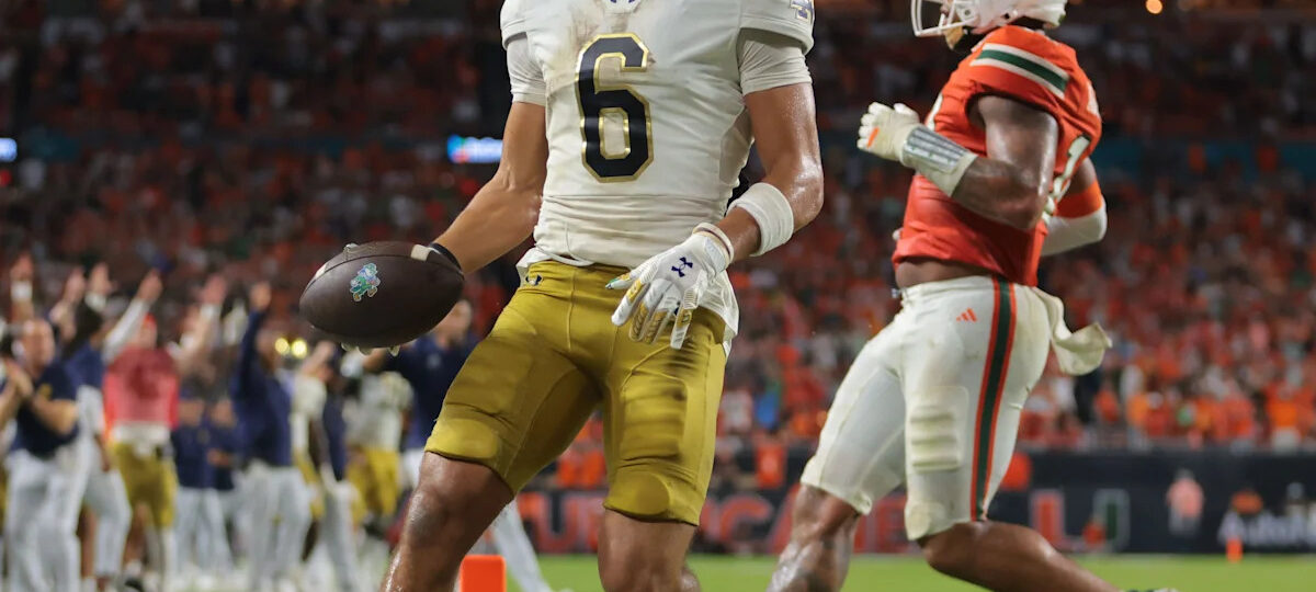
The Big Ten dominates the top of the preseason USA TODAY Sports NCAA Re-Rank 1-138 but the No. 1 spot goes to Notre Dame, which has the talent, coaching and motivation to capture the program’s first national championship since 1988.
Like every College Football Playoff contender, Notre Dame has holes to fill off last year’s two-deep, including crucial losses in the backfield. But the Fighting Irish have skill talent such as running back Aneyas Williams ready to step into larger roles and have upgraded their roster with another strong transfer class.
Notre Dame’s rise to No. 1 bumps down Ohio State, one of three Big Ten teams in the top five. Just behind the No. 2 Buckeyes are No. 4 Oregon and No. 5 Indiana. This group is joined near the top of the re-rank by No. 3 Texas, No. 6 Georgia, No. 7 Oklahoma, No. 9 Miami and No. 10 Southern California.
Overall, the Big Ten and SEC combine for 15 of the top 25 teams in our debut 2026 re-rank. The top 25 also includes three teams from the ACC in Miami, No. 15 SMU and No. 25 Clemson, along with five teams from the Big 12 in No. 12 Texas Tech, No. 14 BYU, No. 20 Houston, No. 21 Arizona and No. 24 Utah.
Who has the best helmet in college football? Here’s a look at the 25 best the sport has to offer heading into the 2026 season.
 1 / 26
Who has the best helmet in college football? Here’s a look at the 25 best the sport has to offer heading into the 2026 season.
 2 / 26
NO. 25 OKLAHOMA. Oklahoma’s interlocking “OU” is synonymous with one of the most successful programs in college football history, a logo worn by the likes of Billy Sims, Lee Roy Selmon, Brian Bosworth and, more recently, Adrian Peterson and Baker Mayfield. When paired with a shiny crimson helmet, it’s one of the best looks in the sport.
 3 / 26
NO. 24 ALABAMA. A look synonymous with college football, Alabama has a simple yet beautifully done design with player numbers. Adorning Alabama helmets since the 1950s, the Crimson Tide haven’t changed their look much since then, and don’t need to. It makes every player stand out while not messing with tradition. A major flex is using the helmet as a logo and the number representing the total national championships, which is at 18 claimed titles. Some teams have done their own versions of adding player numbers to helmets, but it’s a design you always associate with the Crimson Tide.
 4 / 26
NO. 23 WYOMING. The flagship university in the Cowboy State, fittingly, has a cowboy as its mascot and with it, an incredible, distinct logo — a silhouette of a cowboy riding a bucking horse. The image, Bucking Horse and Rider, is actually a registered trademark of the state of Wyoming. The university says it represents “the toughness, and the never-say-die spirit that is Wyoming” and, just as important, it looks awfully good on a helmet.
 5 / 26
NO. 22 BOISE STATE. The non-Power darling does a great job of using a great logo with an oversized look of the Bronco. Oversized logos on helmets usually look good, but this one stands out with how intense it is, especially how Boise State does a nice touch of really making the eye stand out. It could use it on both sides, but it still comes across perfectly on one. No matter what color the helmet or decal is, it works every single time. It’s intense and fierce, matching the tenacity that comes with the blue turf.
 6 / 26
NO. 21 WASHINGTON STATE. Wazzu has one of the best logos in college sports, a cougar head created by Randall Johnson in 1936 that spells out the school’s initials, “WSU.” It has become an iconic symbol for the university and in the broader college football world, thanks in some part to Ol’ Crimson, a Washington State flag that has been in the background of every episode of “College GameDay” since 2003.
 7 / 26
NO. 20 NEBRASKA. The Cornhuskers became a powerhouse when it added the block “N,” and while there’s nothing special about it, the helmet still is among the most recognizable. Nebraska has tried different variations with black that have mostly looked decent, but it further proves there is no need to mess with good ol’ reliable.
 8 / 26
NO. 19 PENN STATE. The Nittany Lions’ lids are proudly plain, with a dark blue stripe down the middle marking the only feature other than white on the helmet itself. For years, they defined Penn State’s no-frills approach under Joe Paterno. As part of the team’s overall uniform, they work exceptionally well, but by itself as a helmet, it’s not as remarkable. There’s a fine line between iconic and boring and these lean just a little too close to the latter.
 9 / 26
NO. 18 UTAH. When you have two primary logos, it’s important to choose the best looking one for the helmet. Luckily, you can’t go wrong with both the feather and retro “UU” logos, allowing Utah to go a plethora of ways with combinations that always come out clean. Plus, the Rose Bowl helmets with the rose interlocked with the logo is one of the best special editions ever seen. Outside of that, the Utes haven’t been afraid to try out bold designs, and they are executed to a tee each time.
 10 / 26
NO. 17 ARIZONA STATE. The Sun Devils already have one of the more distinct color combinations in college athletics, with maroon and gold, and while their partnership with Adidas has occasionally made their uniforms a bit all-over-the-place at times, their best looks are some of the best in the country. While there’s nothing inherently wrong with their trident helmets, they’d be much higher on this list if they made a full-time move back to Sparky the Sun Devil gracing their lids.
 11 / 26
NO. 16 PITT. The Panthers have undergone a series of cosmetic changes over the past 30 years, with their helmets going from the underappreciated “DinoCat” of the Larry Fitzgerald years to the wholly forgettable and uninspired block “PITT” logo. In 2015, the program wisely switched back to the Pitt script that was associated with some of the school’s best teams and players. Pairing it with the traditional blue-and-yellow color scheme makes it that much nicer.
 12 / 26
NO. 15 HAWAII. While many schools incorporate the shape of their state, it’s hard to beat Hawai’i. The Rainbow Warriors proudly display their home with all eight Hawaiian islands adorning one side of the helmet, standing out regardless of the color. The stripe is also unique with feathers that pay homage to the islands’ long legacy of chiefs and warriors. There is no state like the Aloha State, and Hawai’i uses it to its advantage.
 13 / 26
NO. 14 COLORADO. Colorado’s black-and-gold color scheme absolutely pops, especially on the team’s gold helmets on characteristically sunny days in Boulder. The mascot silhouette with an interlocking CU imposed over it is a clean look. It’s enough to make you forgive that the Buffs’ mascot is a bison, not a buffalo.
 14 / 26
NO. 13 SAN DIEGO STATE. After decades of putting the school’s logo or nickname onto its helmets, San Diego State fully leaned into its identity as the Aztecs and produced one of the most memorable lids in the sport. San Diego State’s shiny red helmets feature the unmistakable design of the Aztec sun stone, which blends in just enough with the rest of the helmet that it’s not too distracting or obnoxious.
 15 / 26
NO. 12 MIAMI. Let Miami show you how a simple touch can turn into a cultural phenomenon. The distinctive green and orange “U” logo took off as the Hurricanes became a powerhouse, so much so Miami can also be referred to as just “The U” with the hand signal to go along with it. There have been some interesting modern designs Miami has done with it, but the classic look with the white helmet reigns supreme.
 16 / 26
NO. 11 FLORIDA. Unlike other SEC powerhouses, the Gators haven’t had a consistent helmet design over the past 70 years, going from numbers on the side of the helmet to a basic F (which was worn during Steve Spurrier’s Heisman Trophy winning 1966 season) to some more, um, regrettable choices. In 1979, though, coach Charley Pell introduced a helmet ahead of his first season that has stood the test of time: an orange lid with a white-and-blue stripe down the middle and “Gators” spelled out in script on the sides. Despite the program’s recent struggles, it’s a look that has become synonymous with some of the best teams and most explosive offenses in the sport’s history.
 17 / 26
NO. 10 UCLA. The Bruins struck literal gold in the 1970s when it introduced the script UCLA logo that has gotten some updates over time, but has never faded in beauty. It was so good it wasn’t even the same shade as the school’s official colors. Now it’s more aligned, and the switch to Jordan Brand introduced some really golden shells that shine no matter the time of the day. It perfectly aligns with the stunning views of the Rose Bowl.
 18 / 26
NO. 9 TULANE. In their history, the Green Wave have never stuck with one design too terribly long. If they’re wise, they won’t veer away from what they’ve got now. In 2017, and after wearing it on their helmet much of the 2016 season, the university adopted the “Angry Wave” as the primary athletic mark. Since then, Tulane has had one of the more unique and eye-popping helmets in the sport, a mark that pops that much more with the school’s color scheme of green, sky blue and white. Though with those colors, the Green Wave have seldom had a bad-looking uniform.
 19 / 26
NO. 8 USC. The Trojan warriors don the Trojan head, a logo that technically isn’t an official one but so perfectly done that it would be impossible to remove. The details of the Trojan headpiece are great on a small scale, making great harmony with the cardinal helmet. Even when USC updated its Trojan logo, it still kept this one that’s been around since the 1970s. It holds such high regard that coach Lincoln Riley mandates “the decal should be earned, not just given.”
 20 / 26
NO. 7 LSU. If this were a ranking of college football uniforms, the Tigers would quite possibly be at the very top. Still, their helmet by itself isn’t too bad, either. Though LSU had some variation of a tiger head and the school’s name on their helmets for years, it added a purple facemask in 1980 and smartly hasn’t deviated since. Though the two things are unrelated, the helmet has been worn for the Tigers’ national championships in 2003, 2007 and 2019.
 21 / 26
NO. 6 OREGON. The uniform pioneers, there is no true primary helmet for Oregon, but that’s fine because just about every innovate design Nike gives them hits hard. The Ducks have found a good blend of tradition (the classic “O”) and modernization with the wings, a look that has been so stunning other teams have tried to copy it since then. Whether it’s marble, chrome, an eggshell or a shiny green, Oregon has proved there is no such thing as too many helmets.
 22 / 26
NO. 5 TEXAS. Everything’s bigger in Texas — except the logo gracing the helmet of the football team at the state’s flagship university. It’s for the better, too. Texas’ white helmets with an understated silhouette of a longhorn cattle in burnt orange is a beautiful ode to simplicity. There’s a reason why one of the most recognizable programs in the sport has been wearing some variation of these since the early 1960s.
 23 / 26
NO. 4 FLORIDA STATE. Bobby Bowden is a legend in Tallahassee, and one of the lasting impacts was him putting the Seminole spear on the helmet. It truly encapsulates the Seminole nickname, while being an outstanding and innovative design that easily recognizable in college football, perhaps even more than the Chief Osceola logo. Mix that with the tomahawk stickers and you easily have of the best helmets in the sport.
 24 / 26
NO. 3 OHIO STATE. The Buckeyes’ helmet on its own is perfectly fine — a silver lid with a white, black and scarlet stripe down the middle. What truly separates these, though, are what go with the helmet. As the story goes, in 1968, Ohio State trainer Ernie Biggs devised a system to award players helmet stickers that resembled buckeye leaves. That year, the Buckeyes went undefeated and won the national championship. The tradition, like the stickers, stuck and in the decades since, programs around the country have been copying them. None of them look better than the original, though.
 25 / 26
NO. 2 NOTRE DAME. No decal, no problem. Let the gold shine for Notre Dame with their golden domes that pay homage to the administration building on campus. Is it plain? Yes, but they stand out above so many other programs, and they went up a notch in 2011 when they literally became gold, shining gorgeously in the sun or the stadium lights. The Fighting Irish use the Shamrock Series to get some fun looks, but you really cannot go wrong with the sensational gold helmets.
 26 / 26
NO. 1 MICHIGAN. Shortly after Fritz Crisler was hired as Michigan’s head coach in 1938, he left a mark that would be as lasting as the two Big Ten championships and one national championship he’d help the Wolverines win over the course of his tenure. The newly arrived coach introduced a winged helmet, similar to one he had designed and put into place at his previous stop, Princeton. As he saw it, the winged design would allow halfbacks to find open receivers down the field. Not only did it work — Michigan went 71-16-3 under Crisler — but he birthed what remains the best-looking helmet in the country nearly 90 years later.
No. 23 Boise State is the lone Group of Six team in the top 25. The Broncos are the heavy preseason favorite in the newly rechristened Pac-12. Other top Group of Six teams include No. 31 Navy, No. 33 James Madison, No. 34 Western Kentucky and No. 35 Tulane.
The lowest-rated Power Four teams are No. 113 Purdue, No. 112 Boston College, No. 108 Stanford and No. 104 Colorado. North Carolina comes in at No. 94 heading into Bill Belichick’s second season.
The re-rank goes all the way to 138 teams in 2026 thanks to the addition of North Dakota State (Mountain West) and Sacramento State (Mid-American). While the Hornets land at No. 133, the Bison will open the year ranked No. 72 after closing out a dynastic run as the most dominant program in Championship Subdivision history.

Discover more from NAIRAVOICE.COM.NG
Subscribe to get the latest posts sent to your email.