
From familiar letters and geometric shapes to elaborate crests and symbolic imagery, superhero insignias give fictional heroes a visual identity that readers can recognize instantly. The strongest designs communicate something essential about the character, whether that involves a heroic ideal, a personal history, a distinctive power, or a connection to a wider cause.
Their significance also develops through repeated appearances across major stories, costume changes, adaptations, and generations of fans. An insignia can become inseparable from a hero’s reputation, carrying associations that extend well beyond the page or screen. These designs stand out because their histories and meanings have become as memorable as the characters themselves.
10
Green Lantern’s Power Ring Emblem
<<img src="https://static0.srcdn.com/wordpress/wp-content/uploads/2025/01/green-lantern-planet-mogo.jpg?q=70&fit=crop&w=825&dpr=1" />
</figure>
Unlike emblems tied to one hero, the Green Lantern mark belongs to a corps whose members come from worlds across the known universe and patrol distant sectors. The emblem’s geometric lantern motif recalls the magical lamp associated with Alan Scott, while the familiar Corps insignia emerged with Hal Jordan’s 1959 debut.
Different Lanterns have carried the same insignia through changing comic eras, with Hal Jordan, John Stewart, Guy Gardner, and Kyle Rayner among its best-known wearers. That continuity suits an order whose rings draw upon the universe’s green energy of willpower, allowing each bearer to fashion hard-light forms for rescue, defence, and combat.
9
Wonder Woman’s Double-W Emblem
Wonder Woman’s familiar chest insignia combines two connected W forms with winglike extensions that preserve a visual echo of the eagle she wore for four decades. DC’s 1982 redesign introduced an emblem credited to designer Milton Glaser, replacing the earlier bird with initials that could identify Diana herself across her costume and merchandise.
The new badge first appeared in the Wonder Woman insert in DC Comics Presents , dated January 1982, before reaching her regular title with Wonder Woman the following month. The change also received an explanation inside the story, where representatives of the Wonder Woman Foundation linked the new W to advocacy for women’s equality.
8
The Fantastic Four’s Number Four
<<img src="https://static0.srcdn.com/wordpress/wp-content/uploads/2024/03/fantastic-four-animated-series-with-mister-fantastic-susan-storm-the-thing-and-the-human-torch-standing-next-to-the-fantastic-four-logo.jpg?q=70&fit=crop&w=825&dpr=1" />
</figure>
The Fantastic Four’s chest badge centres on a bold numeral four enclosed within a circle, a compact design that identifies the group through its shared name. Each member wears the same mark on the team’s blue uniform, with the number referring to Reed Richards, Sue Storm, Johnny Storm, and Ben Grimm as the original quartet.
The symbol appeared with the team’s first matching costumes in Fantastic Four , cover-dated March 1962, after two issues in everyday clothing. Within the story, Sue Storm designed the outfits, while Jack Kirby and Stan Lee agreed on the circled four as their shared chest badge for the new uniforms.
7
The Avengers’ A Symbol
<<img src="https://static0.srcdn.com/wordpress/wp-content/uploads/2026/08/marvel-studios-avengers-doomsday-logo-glows-green.jpg?q=49&fit=crop&w=825&dpr=2" />
</figure>
The Avengers’ A mark is built around a large capital whose crossbar extends into an arrow, with a circular stroke curving around much of its form. Letterer Gaspar Saladino devised the treatment for The Avengers , cover-dated February 1972, including the small word “THE” within the arrow as part of the complete title lettering.
Initially introduced as the series’ cover lettering, Saladino’s work gradually outlasted other title treatments and became closely associated with the team itself. Its later use in Marvel’s Avengers films carried the same arrowed letter to a much wider audience, where it frequently appeared without the complete wordmark or accompanying subtitle.
6
The X-Men’s X Insignia
<<img src="https://static0.srcdn.com/wordpress/wp-content/uploads/2026/04/x-men-x-logo.jpg?q=49&fit=crop&w=825&dpr=2" />
</figure>
When Stan Lee and Jack Kirby introduced the X-Men in 1963, their matching uniforms carried an X insignia on the belt buckles, identifying Xavier’s young mutant team. The letter connected their name to Professor Charles Xavier, while the character himself explained its second meaning through the students’ “X-tra” mutant powers during their first adventure.
The same letter survived shifts from the team’s original yellow-and-black uniforms to later blue-and-yellow outfits, carrying their affiliation through successive costume designs. Film adaptations also adopted the X as a compact identifier, though individual productions changed its scale, colour, and position to suit each costume design and overall visual language.
5Enjoying this article? Support our work with a small crypto donation.
The Flash’s Lightning Bolt
<<img src="https://static0.srcdn.com/wordpress/wp-content/uploads/2026/09/the-flash-runs-around-a-room-in-dc-comics-art.jpg?q=49&fit=crop&w=825&dpr=2" />
</figure>
The Flash’s chest symbol pairs a bright yellow lightning bolt with a white circular field, its sharp shape recalling the electricity associated with super-speed. Barry Allen’s debut in Showcase in 1956 introduced this design with Carmine Infantino’s streamlined red uniform, establishing the look that later speedsters would continue to wear.
Jay Garrick had already worn a simpler lightning mark across his red shirt after appearing in Flash Comics in 1940. Barry’s enclosed version subsequently appeared on Wally West and Bart Allen, helping the badge remain associated with successive bearers of the Flash mantle across both comics and screen adaptations.
4
Captain America’s Star-Spangled Shield
<<img src="https://static0.srcdn.com/wordpress/wp-content/uploads/2025/12/captain-america-s-shield-in-the-falcon-and-the-winter-soldier.jpg?q=49&fit=crop&w=825&dpr=2" />
</figure>
Captain America’s shield carries a white star at the centre of a blue field, encircled by alternating red and white bands. Joe Simon and Jack Kirby introduced the hero with a triangular shield in Captain America Comics in March 1941, before the familiar circular version appeared in the following issue.
The circular shield became Steve Rogers’s most recognisable piece of equipment, serving as both protection and a weapon he could throw with remarkable accuracy. Its patriotic palette continued across comic-book covers, animated productions, and live-action films, where the star and surrounding bands remained recognisable even as individual versions altered the shield’s materials.
3
Spider-Man’s Spider Emblem
<<img src="https://static0.srcdn.com/wordpress/wp-content/uploads/2024/12/spider-man-s-hands-crossed-over-his-logo-and-costume.jpg?q=70&fit=crop&w=825&dpr=1" />
</figure>
First seen in Amazing Fantasy in 1962, Spider-Man’s insignia appears as a dark spider against the red fabric of his original costume, anchoring the familiar red-and-blue design. Steve Ditko devised the webbed suit and its central insect motif, linking Peter Parker’s appearance to the radioactive arachnid responsible for his abilities throughout the original story.
That small chest spider has been redrawn repeatedly, with artists changing its body, leg positions, and proportions while preserving its eight-legged silhouette through several costume eras. For example, the iconic black symbiote costume first appeared in The Amazing Spider-Man in 1984, with an enlarged white spider spanning Peter’s chest and back across the black fabric.
2
Batman’s Bat-Symbol
<<img src="https://static0.srcdn.com/wordpress/wp-content/uploads/2025/08/a-close-up-of-batman-s-bat-symbol-in-batman-1989.jpg?q=49&fit=crop&w=825&dpr=2" />
</figure>
Batman’s chest insignia began as a plain black bat silhouette against the grey suit he wore in Detective Comics , published in 1939. The design drew directly on the creature that inspired Bruce Wayne’s chosen identity, while early artists adjusted its outline as his costume developed through those first comic-book years.
In 1964, artist Carmine Infantino added a bright yellow oval around the bat for the New Look introduced in Detective Comics . The revised badge became familiar to television audiences through Adam West’s series, which began in 1966, and remained a recurring design in DC comics for many decades afterwards.
1
Superman’s S-Shield
<<img src="https://static0.srcdn.com/wordpress/wp-content/uploads/2022/12/superman-shield-symbol-dc-comics.jpg?q=70&fit=crop&w=825&dpr=1" />
</figure>
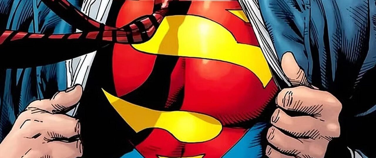
Superman’s chest shield pairs a red S with a yellow field inside a five-sided crest, although its earliest appearance looked considerably simpler on the page. Joe Shuster and Jerry Siegel introduced it in Action Comics (1938), using Superman’s initial inside a small triangular badge Shuster based on heraldic crests.
The familiar pentagonal version emerged through years of revisions, as artists adjusted the outline and internal S before DC settled on a standard design in 1945. Superman: The Movie (1978) later identified it as the House of El family crest, while Superman: Birthright associated the Kryptonian emblem with hope in modern comic continuity.
Discover more from NAIRAVOICE.COM.NG
Subscribe to get the latest posts sent to your email.